01
Overview
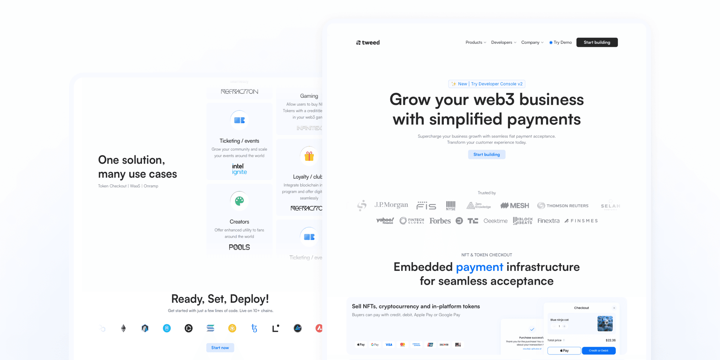
The driving force behind the redesign of Tweed’s website was the need to effectively communicate Tweed’s value proposition and product offering. The previous version left users unclear about what Tweed actually provided, as the content was disorganized and lacked structure. This confusion resulted in visitors missing critical information and not fully grasping the potential of Tweed’s products.
As Tweed expanded its reach, another key reason for the redesign emerged: the need for a more refined visual language to appeal to larger, enterprise-level clients while still preserving the bold, web3-centric identity that makes Tweed unique.
I took ownership of revamping the website to improve user experience and enhance brand perception. Collaborating closely with the co-founders, I led the redesign from research to implementation within just 1.5 months, all while successfully managing and delivering on other key tasks in the company.
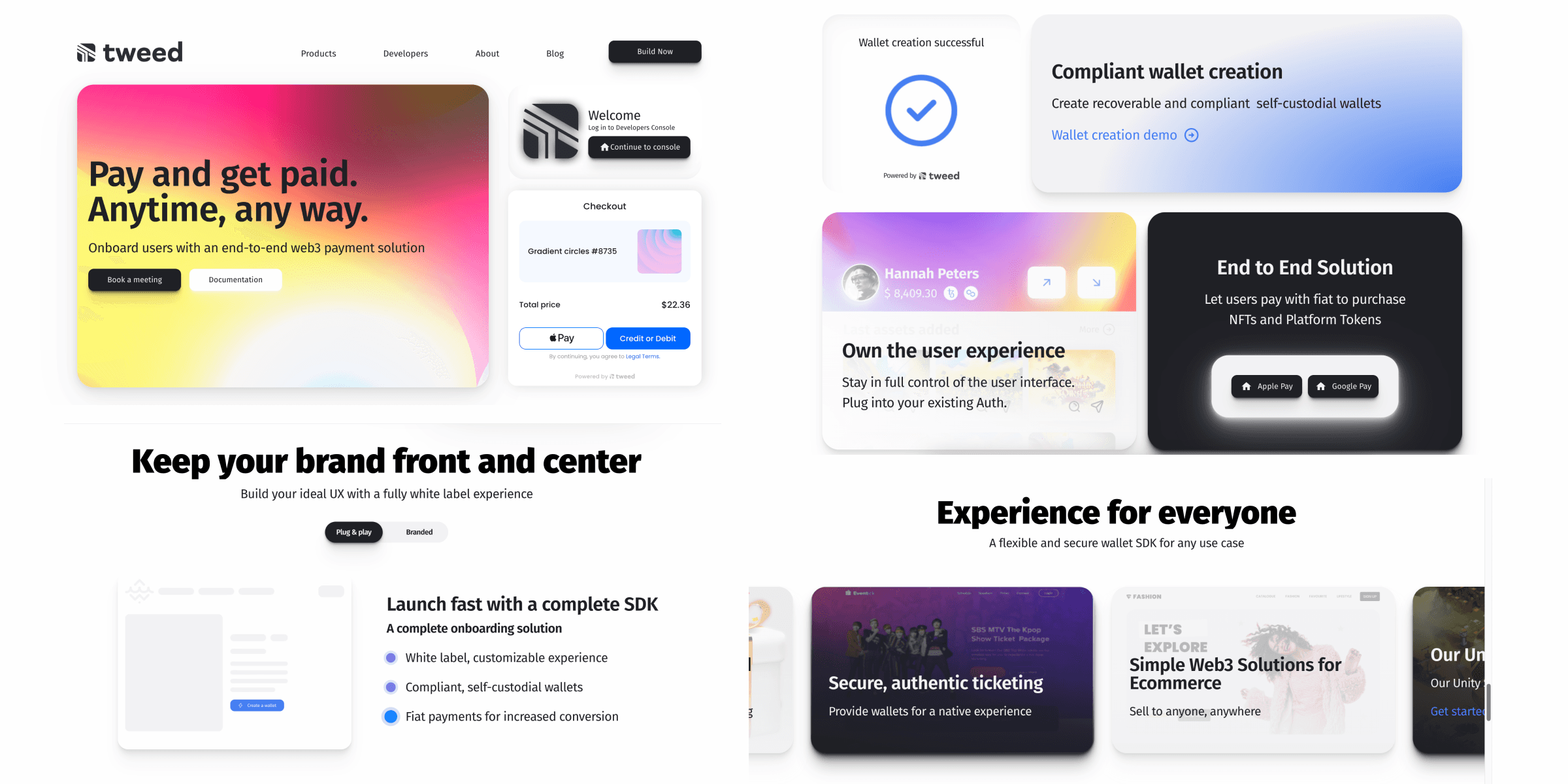


Before
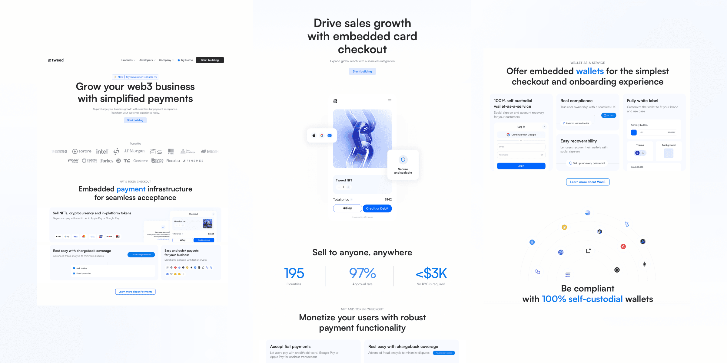


After
02
Research and Discovery
Through a combination of user feedback and analytic tools, I identified pain points:
Lack of a clear product narrative: The website’s confusing structure left users uncertain about Tweed’s offerings, contributing to a high bounce rate of 95% before the redesign
Broken or missing links: These issues created frustration for users and resulted in a significant loss of potential customers
Outdated visual design: User feedback consistently highlighted dissatisfaction with the website's aesthetics, with many describing it as "outdated," which negatively impacted their perception of the brand
No SEO strategy: The absence of an SEO plan and relevant keywords meant that Tweed had little visibility compared to its competitors, making it difficult for potential customers to discover the company
Lack of product visuals and interactive demos: The website did not provide enough visual representation of Tweed’s products, nor did it offer demo experience, which would help users to make an informed decision
03
Process and challenges
One challenge was balancing Tweed’s bold web3 style with the needs of more traditional enterprise clients. I used Framer to build the entire site using no-code tools, which made it easier to make quick changes based on feedback. To keep the design bold and engaging, I added animations and visuals, but also used a clean, simple layout to appeal to professional users. This helped make the site both visually exciting and easy to use.
I also pushed for creating an SEO strategy, something that was missing before. I explained to the team and stakeholders how important SEO is for driving traffic and making Tweed more visible online. I introduced relevant keywords and made sure the site was optimized for search engines, which helped improve its discoverability compared to competitors.
03
Results
The website was launched in August 2024 and already showing great results, such as:
Improved visibility in search engines, organic traffic growth by 20% with average CTR 5.9%
Increased user engagement and reduced bounced rate from 95% to 40.15%
Improved content and its structure on the website making it easier to understand Tweed's value and offering
This project reinforced the importance of aligning business goals with user needs. Designing with users in mind ultimately benefits both the customer and the business by building trust, increasing loyalty, and supporting long-term growth.
The website was launched in August 2024 and already showing great results, such as:
Improved visibility in search engines, organic traffic growth by 20% with average CTR 5.9%
Increased user engagement and reduced bounced rate from 95% to 40.15%
Improved content and its structure on the website making it easier to understand Tweed's value and offering
01
Overview
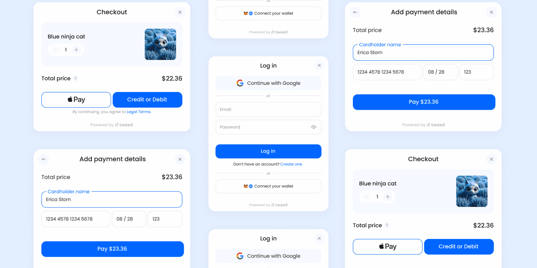
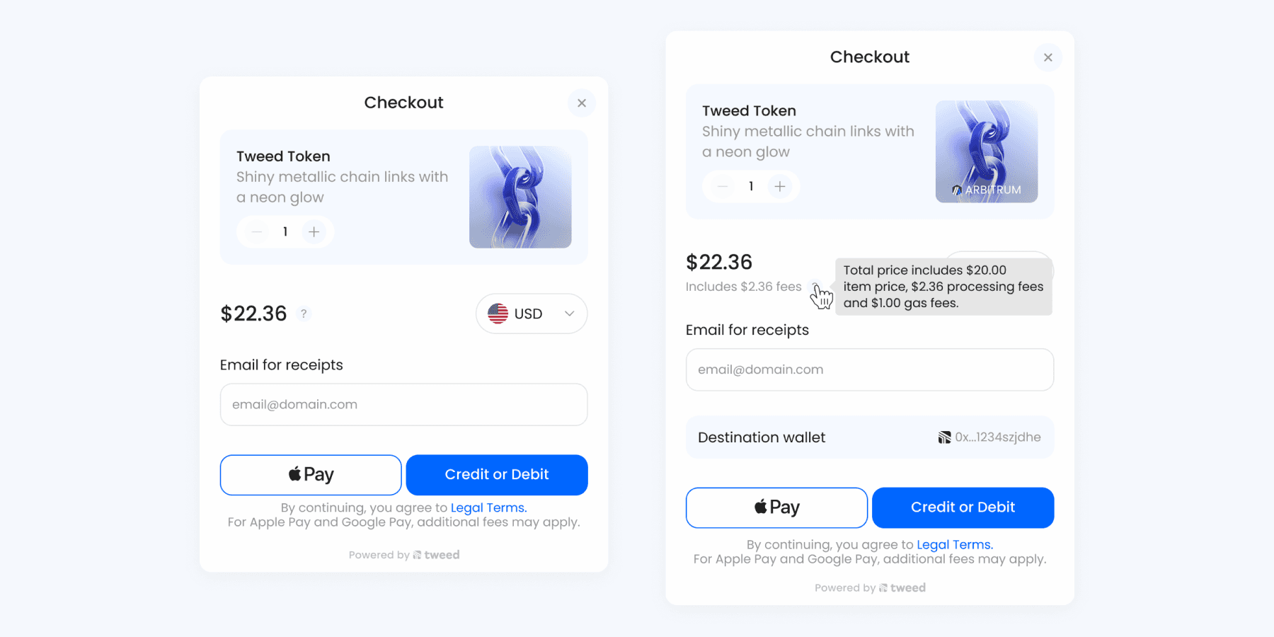
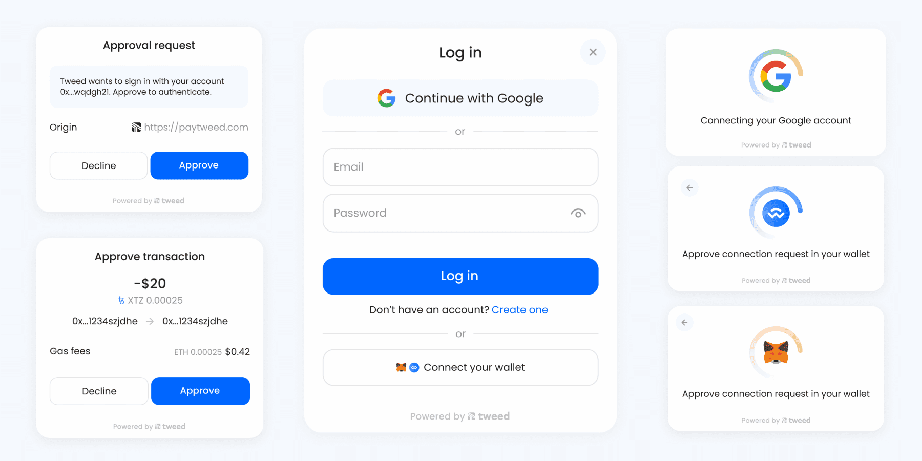
I redesigned the Wallet-as-a-Service and Checkout modals to address missing features, outdated design, and misalignment with our company’s product vision.The new modals improve the user experience, offer flexible Checkout templates for both web2 and web3 users, and provide more customization options through the Developer Console.
The driving force behind the redesign of Tweed’s website was the need to effectively communicate Tweed’s value proposition and product offering. The previous version left users unclear about what Tweed actually provided, as the content was disorganized and lacked structure. This confusion resulted in visitors missing critical information and not fully grasping the potential of Tweed’s products.
As Tweed expanded its reach, another key reason for the redesign emerged: the need for a more refined visual language to appeal to larger, enterprise-level clients while still preserving the bold, web3-centric identity that makes Tweed unique.
I took ownership of revamping the website to improve user experience and enhance brand perception. Collaborating closely with the co-founders, I led the redesign from research to implementation within just 1.5 months, all while successfully managing and delivering on other key tasks in the company.
02
Research and Discovery
Research included customer feedback and competitor analysis::
We found that customers need more flexibility in the checkout widget’s appearance. Companies want to appeal to both Web2 and Web3 users—for example, they may want to display chain info for Web3 users but hide blockchain-related data for Web2 users to avoid confusion.
The modals also required a visual update and expanded customization options within the Developer Console
For compliance and security, we introduced new KYC modals and an updated flow to meet financial regulations, ensuring a safe and transparent experience for all users.
Companies wanted to see price breakdown highlighting all the processing and gas fees
03
Process and challenges
The Checkout process became more complex with the addition of KYC, email collection, price breakdowns, and design templates. Despite these challenges, I streamlined the process to as few steps as possible, ensuring a clear and user-friendly experience.
I began by creating low-fidelity prototypes for Checkout and WaaS, then monitored the number of people going through the Checkout and wallet creation flows to identify pain points:
KYC process length: If the KYC process has too many steps, users may get frustrated and leave before finishing
Email collection friction: Requiring an email early on might put off users who aren’t ready to commit to buying
Complex price breakdown: Showing too many price details (like taxes and fees) can confuse users, making them unsure about the final amount
Unclear error messages: users need to have better guidelines how to recover or prevent errors
This testing allowed me to refine the design and create improved high-fidelity prototypes for implementation.




03
Results
Clear fees, KYC, and customizable pop-ups lead to higher customer satisfaction
KYC adds strong anti-fraud and AML protections
Top-quality UI and UX give us a strong competitive edge
Better error handling, prevention, and recovery reduce unfinished transactions and keep users from getting frustrated
The website was launched in August 2024 and already showing great results, such as:
Improved visibility in search engines, organic traffic growth by 20% with average CTR 5.9%
Increased user engagement and reduced bounced rate from 95% to 40.15%
Improved content and its structure on the website making it easier to understand Tweed's value and offering

